Discovery
Competitive Audit: Review of 15 mobile and web applications with a focus on cancer, clinical trials and with in depth search filtering functionality to understand competitive landscape.

Stakeholder and User Interviews: Interviews were conducted with two stakeholders, three oncologists, two research coordinators, and two patient representatives.
Interesting insight: The lack of time for busy oncologists to communicate with their research coordinators (who surfaced relevant studies) was one main pain point in the process that could be alleviated by this application.

Current and Future Journey Mapping: Journey map took into account the oncologist, research coordinator and patient experiences and how they overlapped during the overall phases of the clinical trial education process.

Mobile Opportunities: Drawing upon existing user behavior and current journeys, points where there was most potential for mobile integration and functionality were outlined in the future journey map.
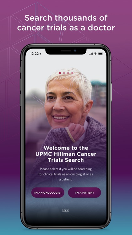
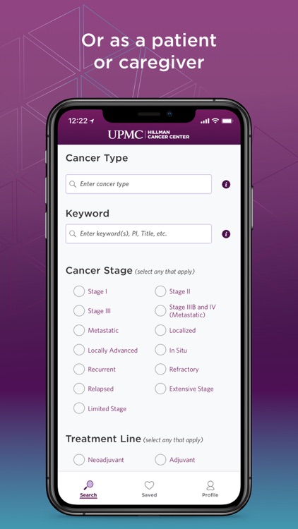
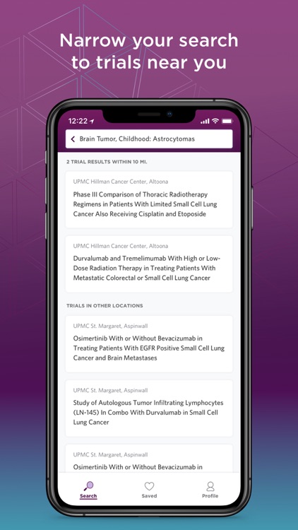
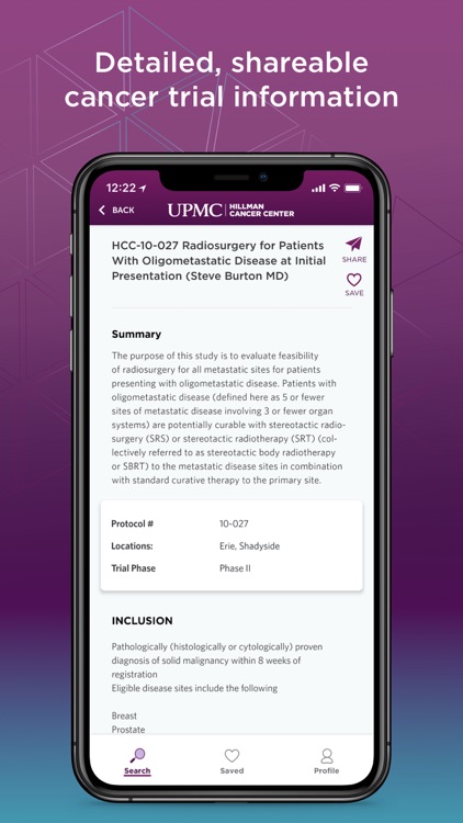
Interesting insight: Oncologists all look for certain information about a trial, so surfacing information related to stage, location and eligibility in an intuitive way key in changing oncologists’ current behavior.

User Flow and Opportunities: Mobile flow was mapped out for the two distinct user types, the research team and the patients, in order to highlight differences needs to the client.

Personas: These were created for the 3 distinct user types, oncologists, research coordinators and patients.

Information Architecture: Iterating from user specific behaviors to a unifying product for all types of users.

UX
Low Fidelity Wireframes: After putting pen to paper (or whiteboard) for some initial scribbles (above), I started to lay out content blocks with low fidelity wireframes.

High Fidelity Wireframes: Since content and the amount surfaced to the user/human is so important with this product, the next step was testing it out with real content and search criteria.

UI + Testing
Visual Design: As a team we put together 3 different concepts and mood boards and after aligning with the client, worked collaboratively to implement final clean design highlighting the dense trial content.

Usability Testing: Testing was done with 8 oncologists, patients and research coordinators with findings and recommendations which were implemented before launch.


