THE CHALLENGE
What’s Good’s initial design was trying to be too much. It had too much information and it was impossible to quickly get into a search screen.
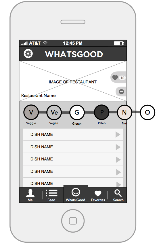
What’s Good’s main value proposition is that a person with any diet can search dishes in 70% of restaurants and find a meal that they can eat. However, amidst numerous features and a lack in visual and hierarchical cohesiveness, users just got lost.


THE SOLUTION
The app’s MVP had been built and designed by developers so we started with with personas to refine our core product features.
Appealing most to the “Health Conscious” and “Redistricted Diet” users was a filtered dish and location search. This way a user could quickly find a vegan dish on a restaurant’s menu, for example, or location with certain kinds of dishes. The “What’s the Best” user wanted to know the best dish at their restaurant or the best burger in town, so we layered on a rating system and filtered “good lists”. For social stickiness, we included personal profiles and a feed where people could see their friends rave about a new dish.
We threw out the MVP.
I redesigned the entire experience starting with an app map, user flow, and extensive wireframing. We used rapid iteration sprints (RITE) to do usability testing with paper prototypes and an digital interfaces. (see findings below)
After product was locked, we polished the brand identity and laid on a sleek red (active for appetite) interface.
WHAT’S GOOD STYLE GUIDE + BRAND VOICE
THE RESULTS
Users we are able to understand immediately What’s Good’s value proposition through its visual simplicity. They easily searched (and found!) specific foods and restaurants that were exactly what they were looking for.

Related Projects


